SEO-friendly service page design starts with intent

Learn how SEO-friendly service page design combines search intent, clear structure, evidence, useful detail and calls to action without writing for algorithms.
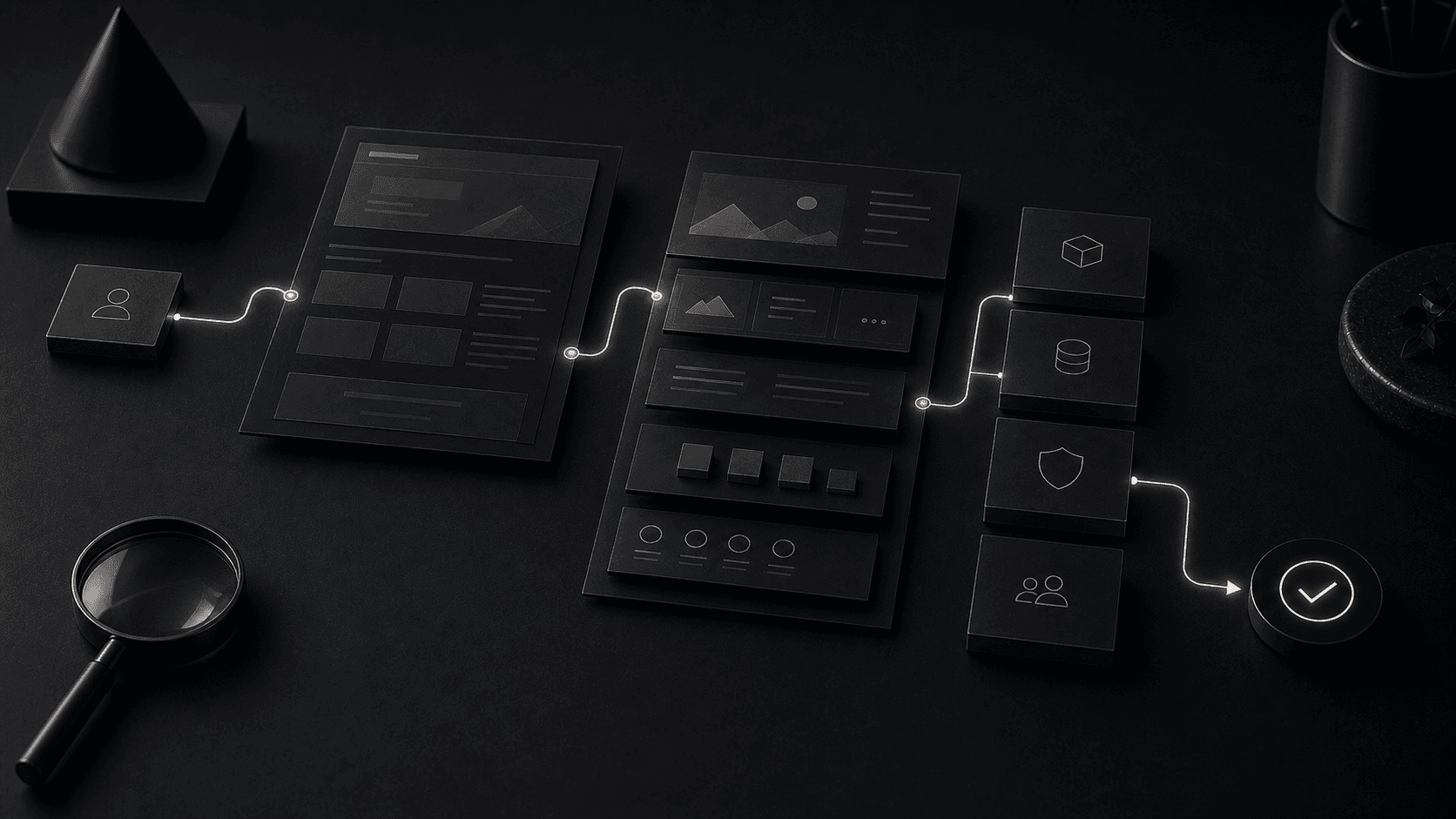
SEO-friendly service page design starts with intent
Place proof of ongoing service quality where the reliability question appears
Repeat the commitment only after the page has demonstrated ongoing value
How service pages can satisfy search intent and support commercial decisions without becoming repetitive or mechanical.
Distinct page jobs sequenced: fit, problem, method, evidence and next step.
core buying questions answered before the page repeats its first call to action
“How service pages can satisfy search intent and support commercial decisions without becoming repetitive or mechanical.”SEO-Friendly Service Page Design field note
SEO-friendly service page design answers the visitor's commercial question in a structure that search engines can understand. The page must name the service clearly, explain who it is for, show what is included, address uncertainty and provide evidence before asking for action. Keywords matter, but repetition does not create usefulness. Strong service pages align language, hierarchy, proof and navigation around one intent, then make the next step obvious at the point where confidence is high enough.
A company searching for a premium managed website service is not comparing features. They are evaluating whether a partner can maintain their digital presence with the same care and reliability that went into building it. The service page should reduce that uncertainty immediately.
The opening section must answer whether this managed service fits their scale, their industry, and their expectations around uptime, performance, and ongoing development. If the page starts listing service tiers before establishing fit, the visitor has to do the qualification work themselves.
For a managed service especially, the visitor needs to trust that the team behind the platform understands ongoing maintenance, security updates, content refreshes, and performance monitoring as a discipline, not as an afterthought attached to a build.
When a visitor reaches the section wondering whether the managed service will actually keep their website running smoothly, that is exactly where uptime statistics, response times, and client retention data should appear. Proof placed beside the doubt it resolves is far more convincing than proof collected in a generic testimonials section.
Managed service buyers care about different proof than project buyers. They want to see evidence of proactive monitoring, average response times to incidents, frequency of updates and improvements, and the longevity of client relationships. These signals demonstrate that the service is operational, not just transactional.
A managed website service is a recurring commitment. The visitor needs to understand not just what they get upfront, but what the relationship looks like six months or a year in. The call to action should appear after the page has addressed the long-term relationship, not before.
The goal is to make each invitation to start a conversation feel timed to the level of understanding the page has built. When the visitor has seen the service structure, the support model, and the proof of reliability, the next step becomes a natural conclusion rather than an interruption.
A service page loses momentum when each section restates the opening promise using new decoration. Assign a distinct question to every part: fit, problem, method, deliverables, evidence, risk and next step. Remove a section if it cannot add information or confidence. The page becomes shorter in perceived effort even when it retains enough depth to support a serious decision.
Headings should allow a scanning reader to reconstruct the argument. Generic labels such as solutions or benefits hide the answer. Use language that describes the decision being resolved. Vary the visual treatment only where it helps the reader recognise a new kind of information, not to make every scroll feel like a separate campaign.
A content model can encourage this discipline by requiring evidence and purpose rather than a repeating headline-copy-button block. The design system should support hierarchy without dictating identical narratives across every service.
Buyers need enough process detail to judge capability, participation and risk. Describe the important stages, decisions and outputs. Avoid naming a proprietary framework when the steps are ordinary or presenting a linear diagram that hides review and iteration. The method should make delivery more predictable, not make the provider sound mysterious.
State what the client must supply and who performs the work. Senior involvement, content ownership and approval routes often matter more than the number of stages. Name the point at which scope, architecture or design becomes committed and how changes are handled.
Website redesign services illustrate this approach by separating discovery, content, design, development and migration responsibilities. Specificity helps a buyer compare proposals and reduces surprises after the project starts.
If a fixed price is impossible before discovery, explain what drives cost and what the first commitment produces. Ranges need assumptions: page types, integrations, content responsibility and support. Hiding every commercial signal behind a contact form forces unsuitable buyers to enquire and leaves suitable buyers unable to assess fit.
Distinguish the deliverable from the outcome. A provider can commit to research, design, implementation and testing; it cannot guarantee revenue or a search position. State exclusions and ongoing costs. Trust grows when the page describes the boundary of responsibility with the same confidence as its benefit.
Use calls to action appropriate to uncertainty. A defined package may support direct purchase, while a complex system needs a discovery conversation. The label should state the next step rather than implying a commitment the visitor has not made.
Scanning is how readers locate relevance before investing attention. Use descriptive headings, short purposeful paragraphs, lists for genuine sets and clear contrast. Keep line length comfortable and avoid hiding essential information in carousels or hover states. A summary can orient the reader, but it should not duplicate every conclusion that follows.
Depth belongs where the decision needs it. Technical buyers may need integration and ownership detail; executives may need risk and business fit. Progressive disclosure can serve both if the core facts remain accessible. Links to focused insight articles let the service page stay commercial while providing evidence for readers who want to investigate.
Performance protects momentum too. Heavy media and animation interrupt the journey when they delay content or respond poorly. Core Web Vitals measure parts of that experience; direct testing reveals whether the page remains easy to understand and operate.
Measure the journey the page is meant to support: relevant entrances, movement to proof, meaningful actions and qualified enquiries. Scroll depth alone cannot show understanding, and a high conversion rate may reflect low-volume branded traffic. Segment by source and intent, then connect enquiries to their quality where the business can do so responsibly.
Use qualitative evidence from calls, support and short user tests. Repeated questions reveal where the page is vague or where the offer itself needs clarification. Make a change against a stated hypothesis and watch guardrails such as lead quality, accessibility and performance.
Conversion rate optimisation works at this structural level. Website design and development should leave the content system and analytics capable of learning. A service page holds momentum when each section earns the next one and the operating team keeps improving the argument with evidence.
Review the search result and the page as one promise. The title and description set an expectation before the visit; the opening must confirm it immediately. If a broad title attracts several incompatible intentions, the body will appear vague to each of them. Strong momentum begins with a focused audience and a page whose first screen clearly continues the result they chose.
Use case studies and related insight links to move detail out of the main argument without hiding it. A buyer can inspect evidence, technical reasoning or a comparison at the moment it matters, then return to the decision. This creates depth without forcing every reader through every qualification and keeps the core service page purposeful.
Finally, test the page with people who have not attended internal positioning workshops. Ask them to identify the offer, fit, reason to trust it and next step after a short scan. Their misunderstandings expose assumed knowledge. Correcting those gaps usually creates more value than adding another benefit block at the bottom.
Repeat the review when the service changes. New deliverables, commercial models and proof can make the old sequence inaccurate even when the visual design remains polished. Assign content ownership and a review date. Momentum depends on the page continuing to represent the real decision, not only on getting the structure right once.
Planning a website or digital system?
Versatech brings senior strategy, design and engineering into one delivery team. The first conversation identifies the useful next step before scope is fixed.
START A PROJECTSEE SERVICESStart with a focused 30-minute discovery call and leave with a clearer route forward.